Color Temperature: What It Is and Why It Changes Everything

"Why do some paintings feel warm and inviting, while others feel cool and atmospheric? And why does adding red to blue sometimes make a gorgeous purple, but other times make a murky grey?"
The answer is color temperature. Once you understand it, you'll start to notice it everywhere—in your reference photos, in light and shadow, and in the birds you paint. It's a concept that can quietly change everything.
The Muddy Mix Problem
Most beginners have experienced this. You mix blue and yellow expecting a fresh green, but end up with a dull, muddy olive. You mix red and blue, hoping for purple, but get grey instead. It's one of the most frustrating parts of watercolor, and it happens to everyone at first.
This happens because of temperature bias. Every color, even the primary ones, leans slightly warm or cool. When you mix two colors that both lean toward a third primary, you end up bringing all three primaries into the mix. Mixing all three primaries creates brown, grey, or mud.
Understanding temperature bias is one of the most practical things you can learn as a watercolor painter. It not only makes your paintings more atmospheric, but also makes your color mixing more predictable and much less frustrating.
1. What Is Color Temperature?
At its most basic, the color wheel is divided into two halves. Reds, oranges, and yellows are warm; they evoke sunlight, fire, and energy. Blues, greens, and purples are cool; they evoke water, shade, and distance.
But it goes deeper than that. Within each color family, there are warmer and cooler versions. This is where most beginners are surprised.
2. Warm vs. Cool Primary Colors
Every primary color has warm and cool versions. The difference is the direction the color leans:
- Yellow: Warm yellow leans toward orange. Cool yellow leans toward green.
- Red: Warm red leans toward orange. Cool red leans toward purple.
- Blue: Warm blue leans toward purple. Cool blue leans toward green.
This matters more than most beginners realize. Two reds that look almost identical on the palette can act very differently in a mix, because one leans warm and the other leans cool.

3. The Hidden Temperature Bias
This leaning is called temperature bias. Even a pure primary color often has a small trace of another primary hidden inside it.
Alizarin Crimson is a cool red that leans slightly toward blue. Cadmium Red is a warm red that leans toward yellow. They both look red, but when you mix them, they behave very differently.
Once you start thinking about your paints this way, not just as colors but as temperatures, your whole approach to mixing will change.
4. Why Do My Colors Turn to Mud?
Here's the practical rule that will immediately improve your mixing.
Here's what's actually happening when colors go muddy. If both colors you're mixing lean toward a third primary, that third color sneaks into the mix. Alizarin Crimson is a cool red that leans toward blue. Ultramarine is a warm blue that leans toward red. Neither has much yellow, so the purple stays clean. But if you mix a warm red and a cool blue that both have a yellow bias, that hidden yellow dulls everything before you even touch the paper.
If you mix a warm red, one that already leans toward yellow, with a cool blue that also leans toward yellow, that hidden yellow dulls everything. The colors themselves aren't wrong. It's the temperatures that cause the problem.
Before you reach for a color, ask yourself which way it leans. That single question will save you from many muddy mixtures.
5. Mixing Vibrant Secondary Colors
The same principle applies to every secondary mix:
- Cool yellow plus cool blue make a bright, clean green — both lean toward green, and neither carries hidden red.
- Warm yellow plus warm blue make a natural, muted, earthy green — both lean toward red, and that hidden warmth neutralizes the mix.
Neither result is wrong, but now you are choosing the outcome instead of just hoping for it.
6. Using Temperature for Depth and Atmosphere
Warm colors move forward and pull toward the viewer. Cool colors move back and push into the distance. Use this on purpose to create depth without complicated techniques.
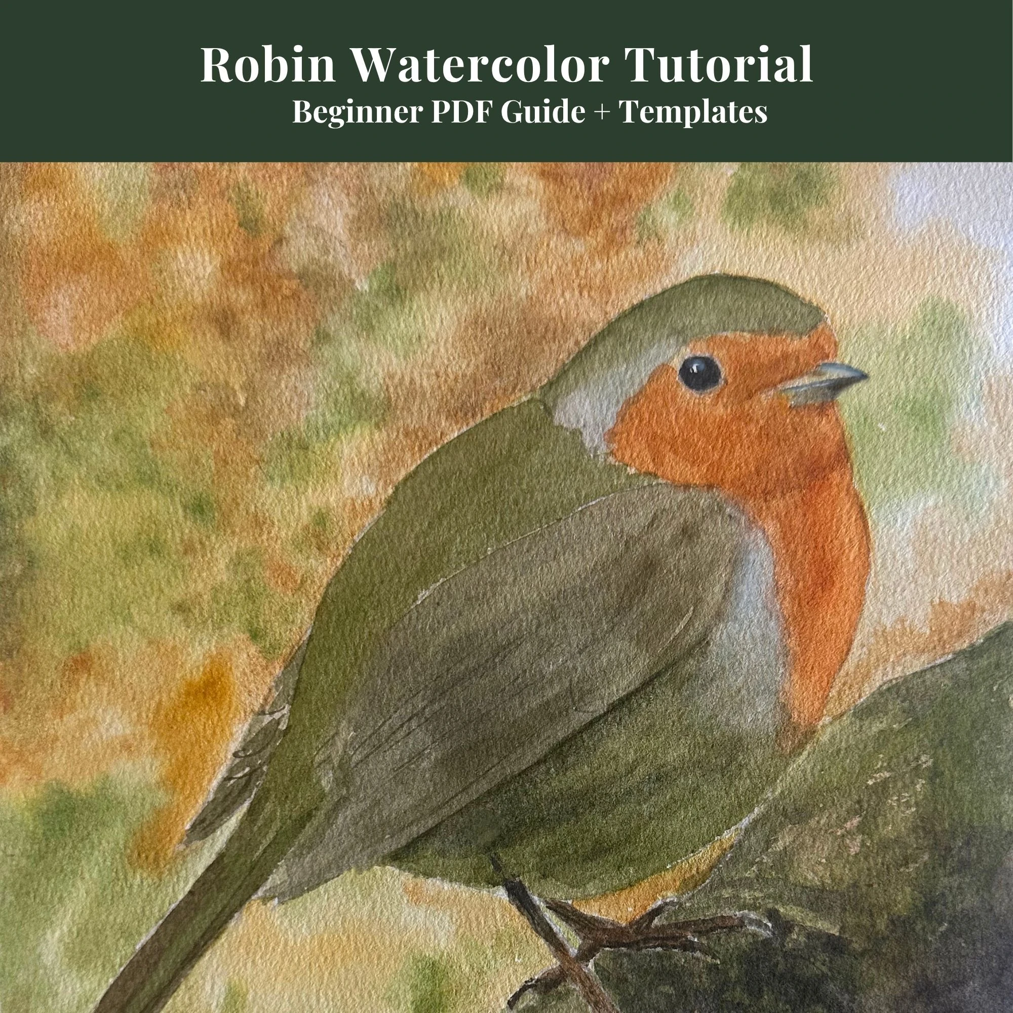
If you want a bird to stand out from the page, paint its breast and face with warmer tones and use cooler colors for the shadows and background. Adding a touch of cobalt blue or neutral tint to your background wash, even if it's very diluted, will push the background back and make the bird feel more present and three-dimensional.
Here's a simple test: add a touch of cobalt blue or neutral tint to your background wash the next time you paint a bird. Keep everything else the same. The bird will feel more present and three-dimensional, even though you haven't changed the bird itself.
This is called atmospheric perspective, and it works whether you're painting a robin on a branch or a distant treeline.
7. Creating Mood in Your Paintings
Beyond technical mixing, color temperature is one of your strongest tools for conveying mood.
A painting with mostly warm colors feels energetic, cozy, or sunlit. A painting with mostly cool colors feels calm, mysterious, or overcast. If you paint the same subject twice, once with warm colors and once with cool colors, each version will feel completely different.
You don't need to plan this obsessively. Just be aware of it. Ask yourself before you start: Do I want this painting to feel warm or cool? Then let that decision guide your mixes from the first wash.
Putting It Together
Color temperature won't solve every painting problem, but once you start noticing it, you can't ignore it. It's in every reference photo, every light source, and every shadow you see.
Start with one thing. The next time you mix a purple or green that looks dull, ask yourself if both colors lean the same way. That one question will quietly and permanently change how you mix.
Continue learning with the next step in this watercolor series.