Simplifying backgrounds: when to leave white space or add color
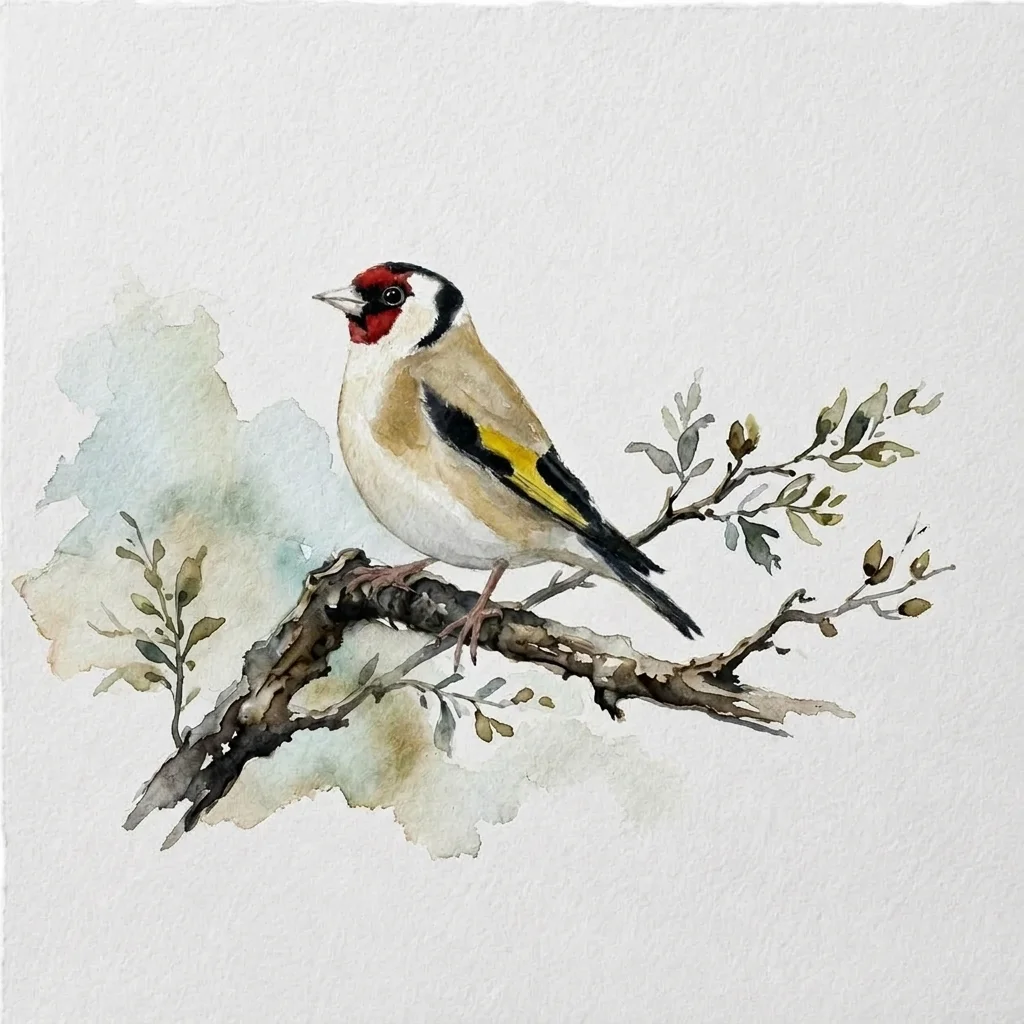
"I paint a great subject, but when I try to fill in the background to 'finish' the painting, it completely ruins the piece."
Many beginners feel this way and want to paint from edge to edge. In school, we learn to color the whole page, but in watercolor, leaving some paper unpainted can be a powerful design choice.
Experienced painters know when to add a loose, wet-on-wet background and when to leave the paper bright white.
The Power of Restraint
If your subject is detailed, vibrant, and complex, such as a realistically painted bird, a busy background will compete for attention. Leaving out the background frames your subject and directs the viewer’s eye where you want it.
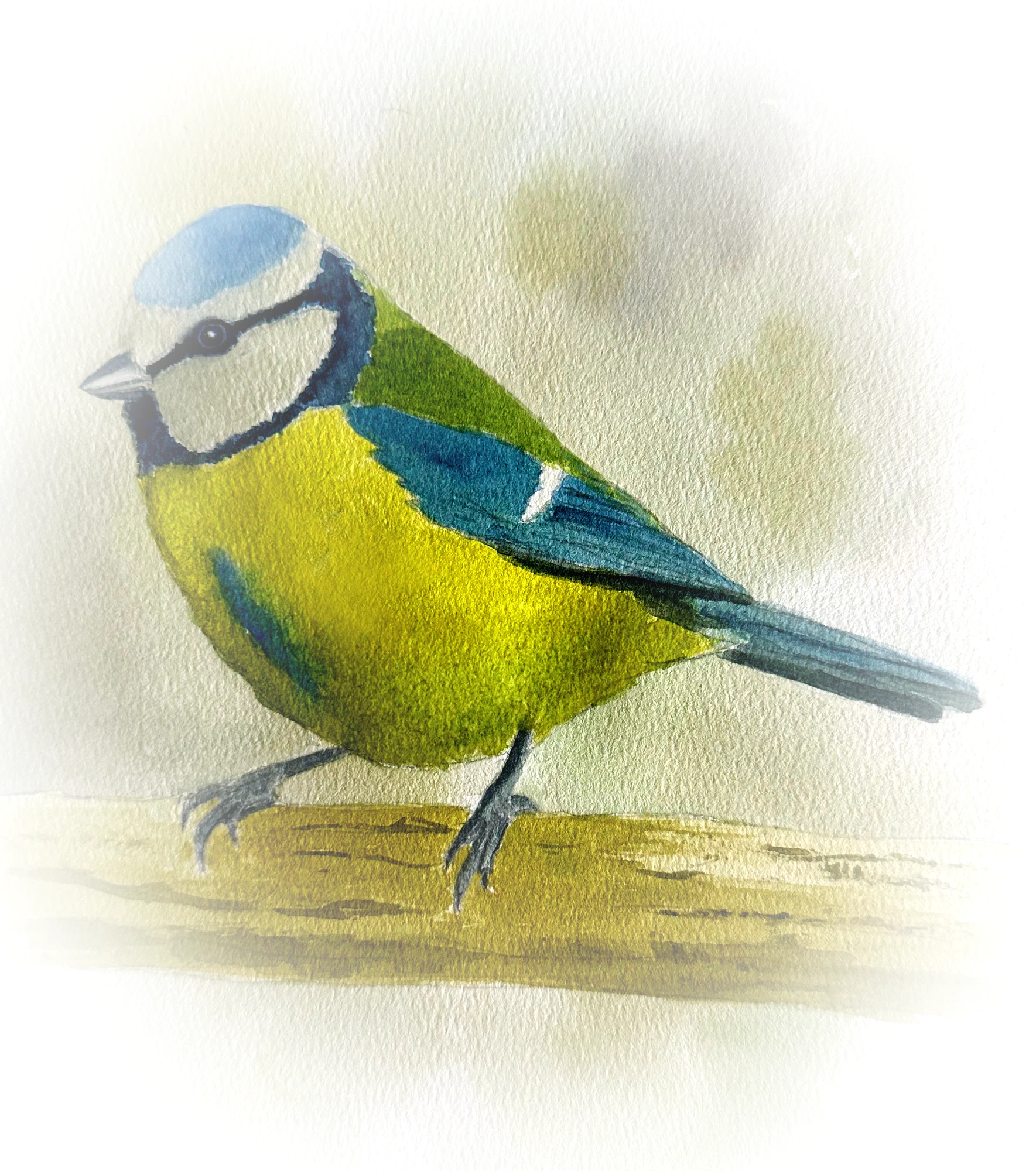
EMBRACE THE VIGNETTE
Instead of filling the whole space, let your background elements, such as a branch or an abstract wash, vignette. This means they gently fade out before reaching the edge of the paper.
When to Add Color
Sometimes you need a background color to help your subject stand out. This effect depends a lot on contrast.
- Light subjects: If you are painting a white dove or a snowy egret, you *must* have a dark background behind it to create an edge. White paper cannot stand out against white paper.
- Complementary washes: If your subject is mostly orange, adding a loose, pale blue wash in the background will make the orange look even brighter.
- Keep it loose: If you choose to paint a background, use a big brush and work wet-on-wet. Avoid adding tight details behind your subject.
I hope these tips help you know when to stop painting. Remember, empty white space is not missing paint—it is an important part of your design.
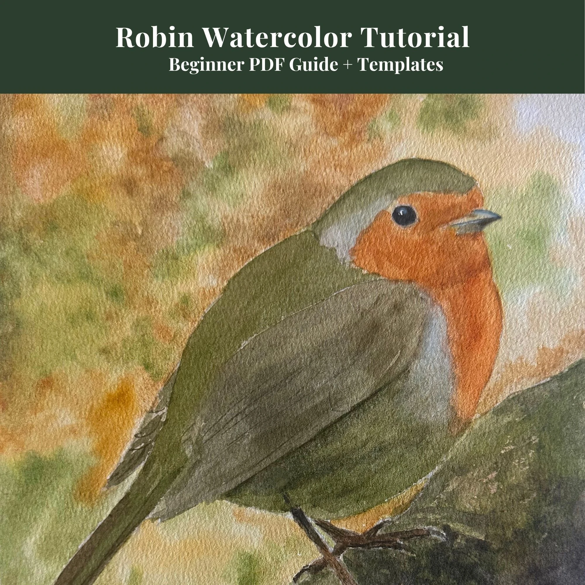
Beginners Robin Tutorial
Complete 13-page digital guide showing you step-by-step Robin wash layers.
View on Etsy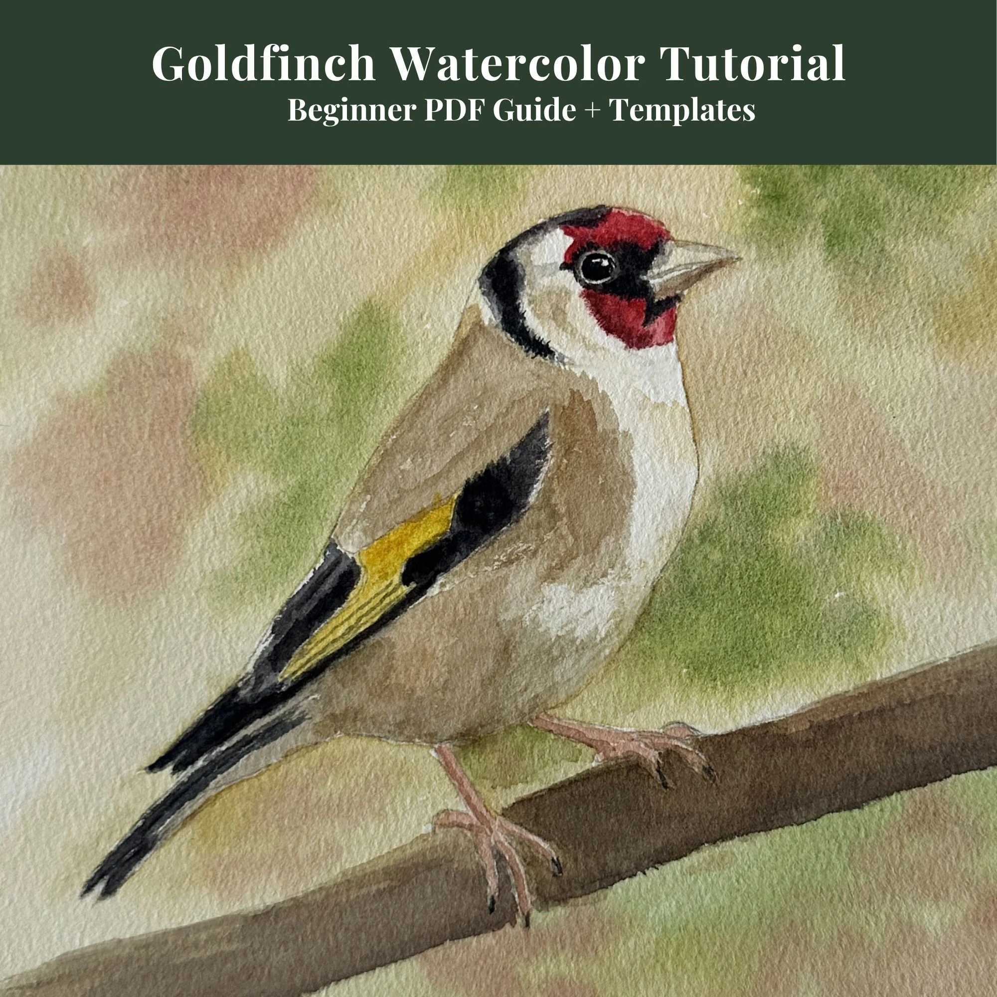
Beginners Goldfinch Tutorial
Master high-contrast wings, glowing yellow backs, and the bright red face.
View on Etsy
Ultimate Bird Painter's Kit
My master bundle combining step-by-step guides, 30 outlines, and cheat sheets.
View on EtsyContinue learning with the next step in this watercolor series.