How to create depth with just two or three colors
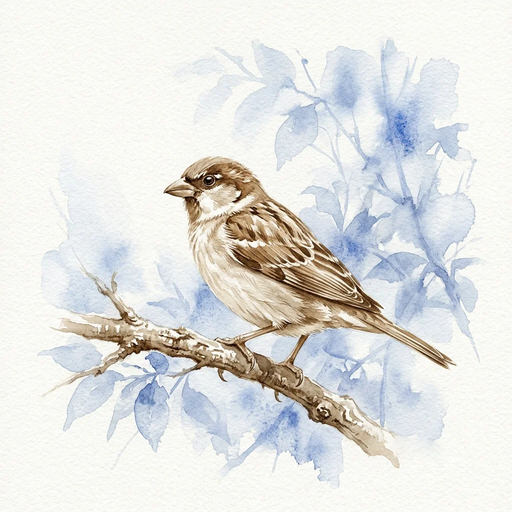
"My paintings look flat and cartoonish. How do I make them look three-dimensional without mixing a muddy mess?"
The good news is that depth has little to do with how many colors you use. Many artists who create the most atmospheric and dimensional work often use just two or three pigments. Depth doesn't come from variety; it comes from understanding two simple visual rules: value and color temperature.
Once you understand these ideas, you’ll see flat paintings differently.
Atmospheric Perspective: How Distance Changes Color
Step outside and look at something far away, like a treeline or a distant hillside. Notice how they look lighter, hazier, and a bit blue compared to what’s close to you. That’s atmospheric perspective, one of nature’s most reliable depth cues.
You can recreate this effect in watercolor by following one simple rule: warm colors come forward, and cool colors move back.
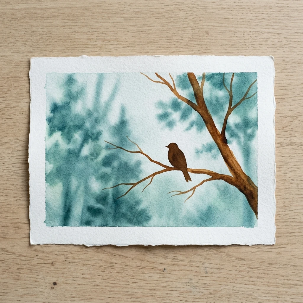
WARM VS COOL COLORS
Reds, yellows, and oranges feel close and immediate. Blues, greens, and purples feel distant and light. So your foreground subject, like a bird on a branch or a flower in focus, should use warmer, more saturated colors. The background should have a loose, cool wash that gently pushes it into the distance. With just two colors, you can create instant depth.
The other important part of atmospheric perspective is value. Distant objects are not just cooler; they are also lighter. If your background is too dark, it will compete with your focal point and flatten the sense of space. Keep your background washes pale and let them fade at the edges.
The Power of Edges: What Your Eye Focuses On
Look at any photograph and notice where your eye goes first. It is usually drawn to the sharpest, highest-contrast area in the picture. Everything else looks a bit soft or blurred. Your painting should work the same way.
- Sharp, crisp edges tell the viewer, "This is important; look here." Use them on purpose at your focal point, such as the eye of a bird, the front edge of a wing, or the tip of a beak.
- Soft, blurred edges tell the viewer, "This is background; don't linger." For anything in the distance, drop your color onto wet paper and let it spread. Avoid chasing it with your brush. The soft, unpredictable edge that forms will suggest distance better than any carefully painted background.
- High contrast, where your darkest darks meet your lightest lights, should only appear at the focal point. Keep everything else in a softer mid-range, and your subject will stand out without changing any colors.
THE SIMPLE VERSION
Warm, sharp, and high-contrast elements come forward. Cool, soft, and low-contrast elements move back. That’s the whole system. You do not need twenty colors to make a painting feel deep and dimensional; you just need to use two or three colors with purpose.
Keep your distant areas cool and blurry. Keep your foregrounds warm and sharp. If you do these two things every time, your paintings will not look flat again.
Continue learning with the next step in this watercolor series.