How to Simplify Watercolor Backgrounds Without Overworking Them
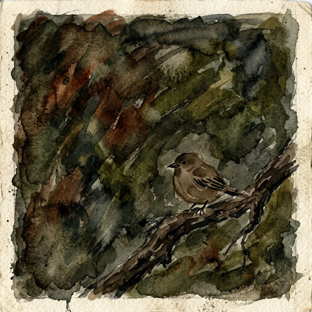
"Every time I paint a background, it ends up looking muddy, heavy, and overpowering."
1. The Background’s Job
The background’s role is to help the subject stand out, not to fight for attention.
A good background is often one you barely notice. If your eye goes to the background before the subject, something’s off. Sometimes, a background that feels boring to paint is actually perfect.
2. You Don’t Need to Fill the Paper
White space adds light, air, and a feeling of distance. Leaving parts of the paper blank doesn’t mean your painting isn’t done. It’s a decision you get to make.
When you fill in the whole background, everything ends up on the same level and there’s no space to breathe. Many of the best bird paintings actually have more empty paper than paint.
3. Suggest, Don’t Describe
You don’t have to paint every leaf. Just hint at the foliage.
A few loose marks in the right spot can look like foliage. One warm-grey wash under the bird can suggest the ground. A soft wet-on-wet area, left alone while the paper is damp, can show distance.
If you try to spell out the background with your brush, you lose the magic. The viewer’s eye fills in what you leave out. That’s not just a shortcut; that’s when watercolor really shines.
4. Keep Background Values Quiet
Strong contrast grabs attention. If your background is as dark or light as the bird, nothing stands out. Everything fights for attention, and the painting feels busy.
Keep the background values similar to each other. A gentle mid-tone wash with little change helps the bird’s lights and darks pop. The contrast doesn’t have to be bold, just enough to make a difference.
5. Lose Edges to Push the Background Back
If you use hard edges everywhere, everything seems equally important. Every sharp line asks for attention, and the bird can disappear.
Let the background edges fade away, especially where they touch the bird’s back and wings. A wet-on-wet area that disappears into the paper adds more depth than lots of careful detail. Soft edges don’t make a painting weaker. They give it space.
6. Why Backgrounds Get Overworked
Overworking sneaks up on you. You add another wash because the first one seemed too light. You fix an edge that feels too soft. You add more marks because the foliage looks unfinished. Each step makes sense, but before you know it, the background has taken over.
The risky moment comes when the background feels unfinished. That feeling is usually misleading.
Set your brush down and look at the bird. If the bird stands out and the background isn’t distracting, you’re done—even if the background feels unfinished by itself. Step away for ten minutes. When you come back, it will look more finished than you expected.
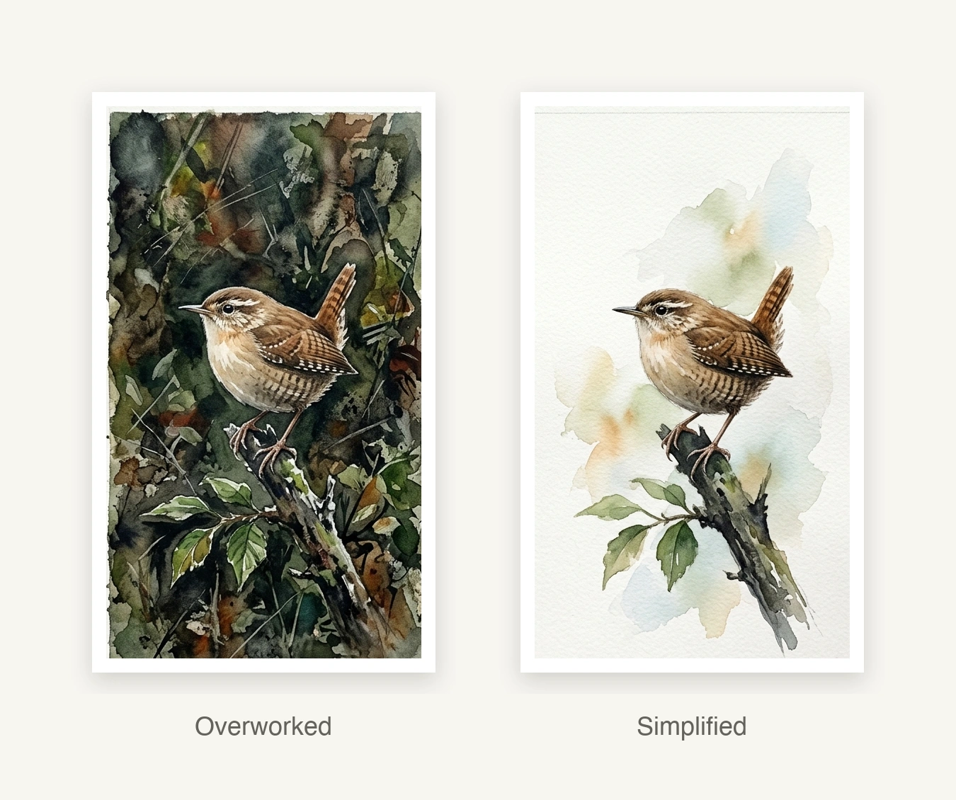
7. Comparison — Simple vs Overworked
Imagine two paintings: same bird, same colors, same idea. In one, the background was left alone after the first wash. In the other, it was worked on until it seemed finished.
Notice where your eye goes first in each painting.
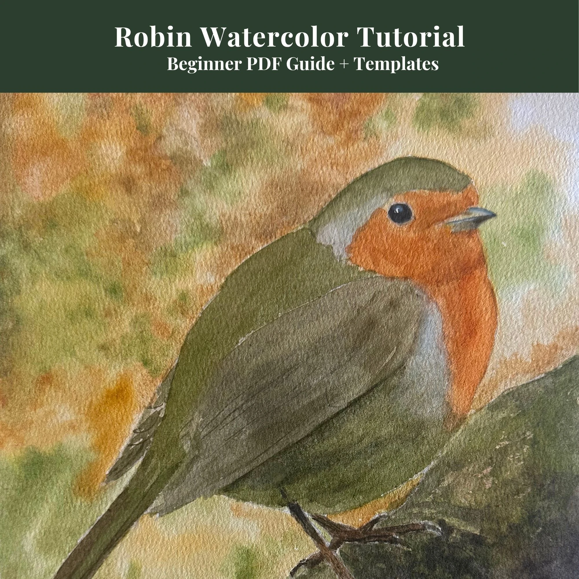
Beginners Robin Tutorial
Complete 13-page digital guide showing you step-by-step Robin wash layers.
View on Etsy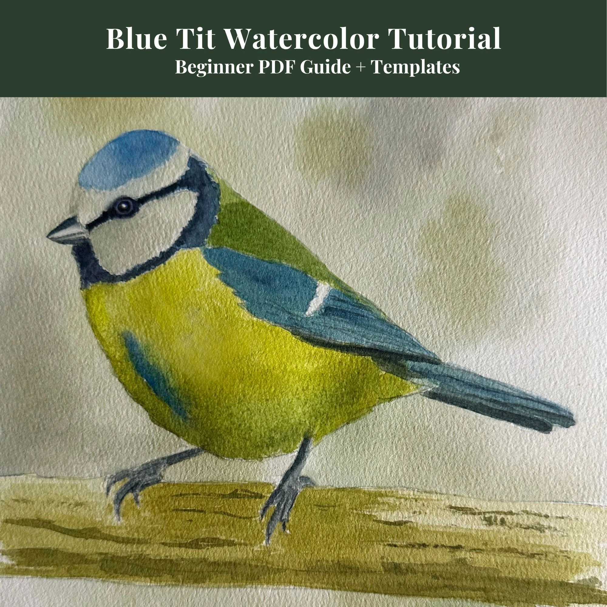
Beginners Blue Tit Tutorial
Learn my simple 4-stage color layering method with outlines included.
View on Etsy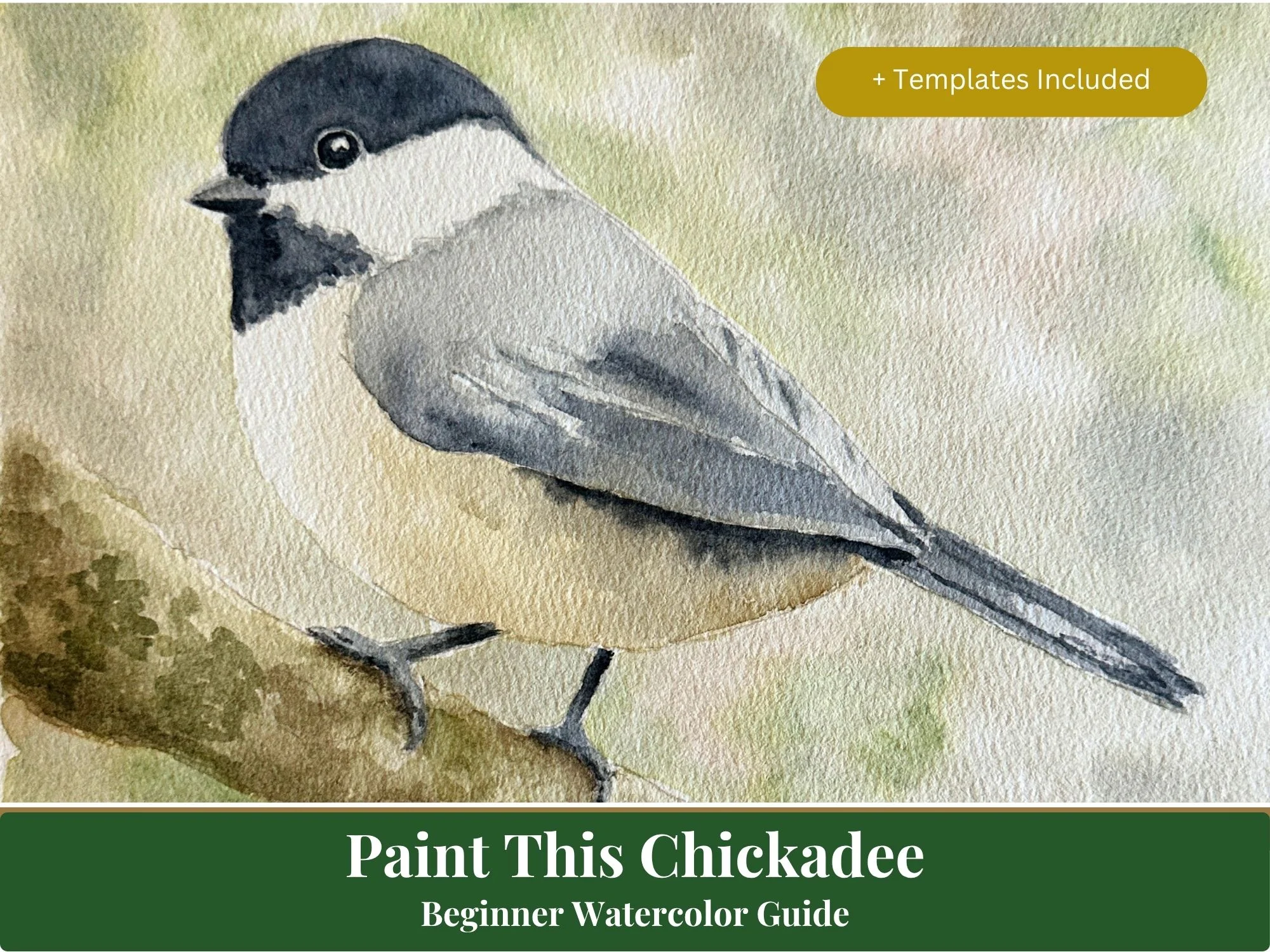
Beginners Chickadee Tutorial
A detailed beginner's guide covering head, bib, and wing glaze details.
View on Etsy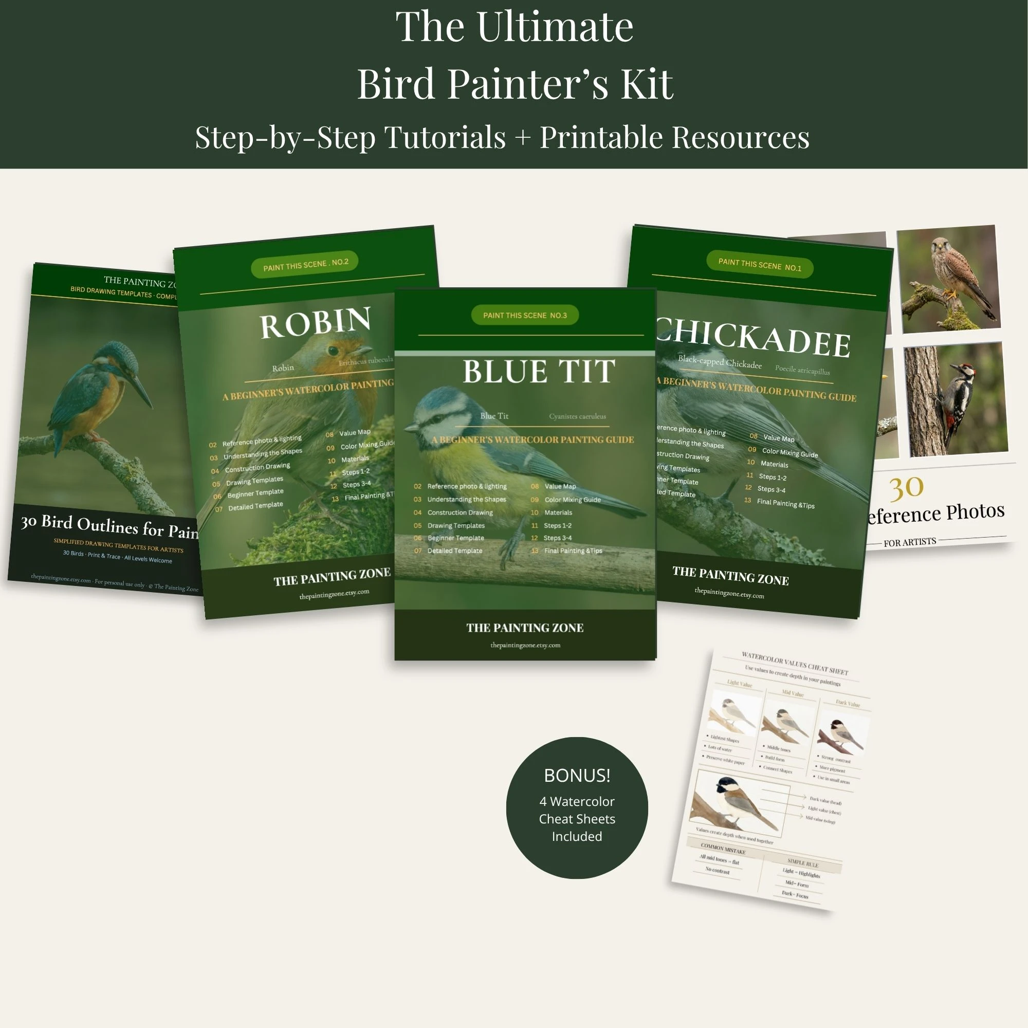
Ultimate Bird Painter's Kit
My master bundle combining step-by-step guides, 30 outlines, and cheat sheets.
View on Etsy