Cheap vs. Professional Watercolor Paints — Is It Worth Upgrading?
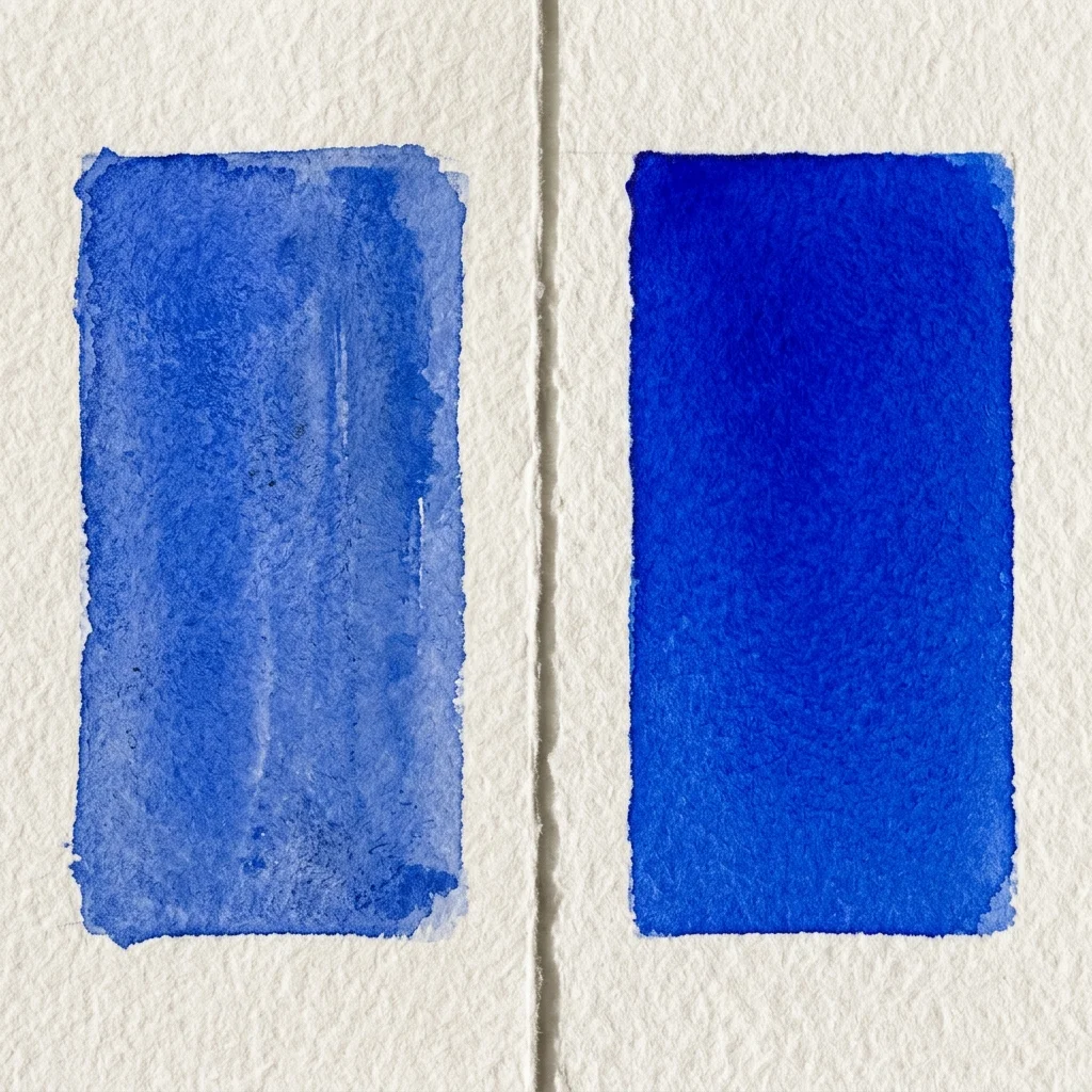
"The biggest lie in watercolor is that beginners should start with cheap paint. Cheap paint doesn't behave like watercolor, making the hardest medium even harder to learn."
This page contains affiliate links. If you purchase through them I may earn a small commission at no extra cost to you. I only recommend products I personally use and believe in.
We’ve all been there. You stand in the art supply store staring at a cheap palette of 36 colors, and right next to it is a tiny, 5ml tube of professional paint that costs $15 for a single color. Your brain tells you to buy the big palette because you are "just a beginner."
This is a trap.
Watercolor is entirely about transparency and how pigment particles interact with water. When you buy cheap "student grade" or craft paints, you aren't just getting less pigment—you are getting a completely different chemical product that fights you every step of the way.
1. Pigment Load and Vibrancy
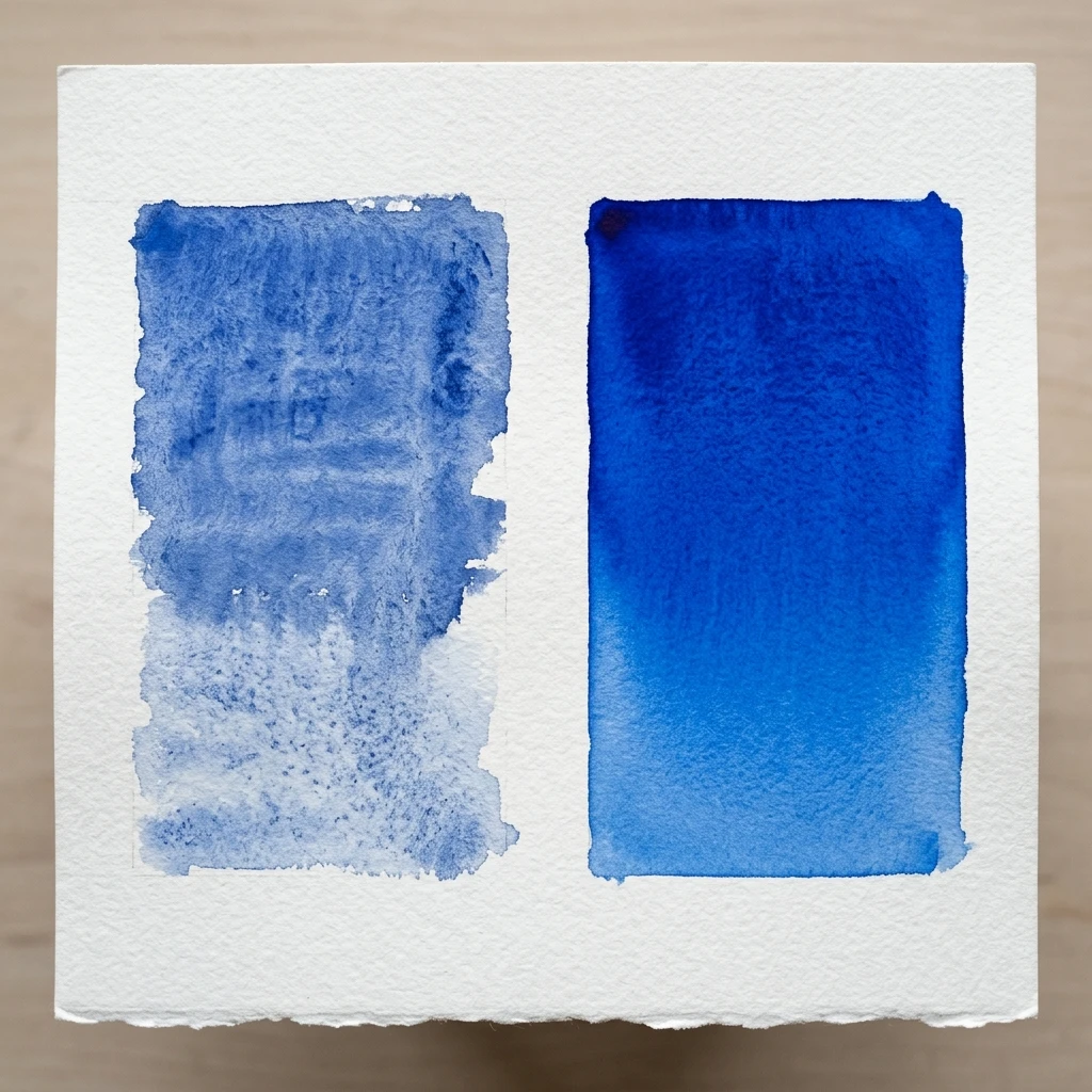
Professional paints have a high pigment load. This means a small drop of paint contains thousands of pure color particles. When you mix it with water, it retains its intense, glowing vibrancy even when diluted.
Student-grade paints contain significantly less pigment. To fill the tube, manufacturers add cheap fillers. As a result, you have to aggressively scrub your brush into the pan to get enough color to show up on the paper. The color is weak and difficult to build up.
2. The "Chalky" Problem (Binders and Fillers)
Those cheap fillers I just mentioned? They are usually made of chalk or synthetic brighteners.
The beauty of watercolor is that light passes through the transparent paint layer, bounces off the white paper underneath, and reflects into your eyes. It acts like stained glass. But when a manufacturer adds chalk to bulk it out, the paint becomes opaque. Light can no longer pass through it. Instead of glowing, the paint looks flat, dull, and powdery when it dries. You lose the very essence of what makes watercolor beautiful.
3. Why Cheap Paints Produce Mud
In my previous tutorial on why watercolors turn to mud, I talked about the dangers of mixing too many pigments.
Professional paints are often "single pigment" colors (e.g., pure PB29 Ultramarine Blue). You know exactly what you are mixing. Cheap paints are usually "hues" (e.g., "Ultramarine Hue"). A hue is an imitation color made by mixing three or four cheap, random pigments to mimic a more expensive pigment.
If your blue is made of 3 pigments, and your yellow is made of 3 pigments, mixing them doesn't give you green. It gives you a slurry of six different pigments pulling in different directions. The result is instant, unavoidable brown mud.
4. Flow and Dispersion
Professional paints are milled finely and bound with high-quality gum arabic. When you touch a loaded brush to wet paper (a technique I showed in the water control tutorial), professional paint instantly explodes and travels beautifully across the water layer.
Student-grade paints tend to clump. They drop onto the paper and sit there in a heavy puddle, not blend or travel smoothly.
Navigating the Brands: Where to Start
When you are finally ready to upgrade, the art supply aisle can still be incredibly confusing because many brands produce both student and professional lines.
- Daniel Smith: Widely considered a gold standard for modern watercolorists. They produce only professional-grade paints, known for their incredible vibrancy and massive pigment load.
- Winsor & Newton: Their student line is called Cotman (widely available, but slightly chalky). If you want their professional line, look specifically for tubes labeled Professional Water Color.
- Holbein HWC: A superb Japanese brand known for brilliant colors and a finely milled consistency without the addition of ox gall, so they handle beautifully on paper.
The Verdict: When to Upgrade
If you are struggling with watercolor, it might not be your technique. It might be your paint. You do not need a 36-color professional palette. In fact, that's a waste of money.
Buy just three professional-grade tubes to start. A warm red like Daniel Smith Pyrrol Red, a cool yellow like Daniel Smith Hansa Yellow Deep, and Daniel Smith French Ultramarine will get you further than any beginner palette ever could. With these three tubes, you can mix a large range of colors, and more importantly, you will finally experience what watercolor is actually supposed to feel like.
If you'd like to see the full palette I use every day—all twelve colors I use when painting birds and nature—along with my recommended brushes, paper, and accessories, visit my Recommended Materials page.
THE BOTTOM LINE
Watercolor is hard enough without fighting your materials. Investing in just a few tubes of high-quality, single-pigment professional paint will instantly eliminate many of the issues holding you back.
Continue learning with the next step in this watercolor series.